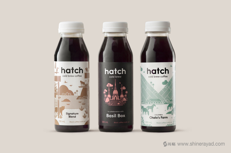
位于多倫多的Hatch是一種生產(chǎn)即飲冰咖啡的咖啡烘焙機品牌。這種咖啡使用的是高品質(zhì)自然成分,使用過濾兩次的工藝制作過程�,用特殊灌裝技術(shù)以保持其新鮮口感����。Hatch打算把冷泡咖啡從一個不斷增長的市場商機變成主流商品。為了實現(xiàn)這個目標���,他們和加拿大品牌設(shè)計公司TUNG合作來開展品牌定位和產(chǎn)品包裝設(shè)計工作��。
Toronto-based Hatch is a coffee roaster producing ready-to-drink cold brew coffee from high quality natural ingredients using a craft-oriented twice-filtered manufacturing process and a unique bottling technology to seal in fresh flavour. Hatch intends to bring cold brew coffee from a niche but growing market into the mainstream and worked with Canadian graphic design studio Tung to help them achieve this through brand identity and packaging.
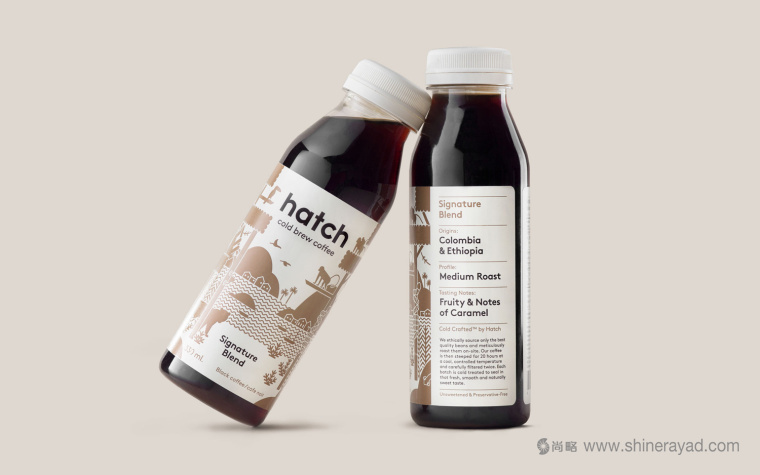
Hatch的目標用戶是咖啡行家和一般消費者�����。Tung打算通過融合不同因素的插畫來強調(diào)這一點 - 在國外的土地上落地并探索�,最流行且最易得的品質(zhì)類型。對以下內(nèi)容有了清晰了解后再尋找更具深度的東西 - 一個清楚表明了起源�,口味和烘焙機信息的結(jié)構(gòu)。同時迎合兩種完全不同的消費者群體是不容易的���,折中的做法有可能是對兩者都沒有吸引力��。但是��,要記住為產(chǎn)品的本性服務(wù)�����,而不是坐享其成。Tung品牌設(shè)計公司似乎在其中找到了一種平衡�����。
Hatch intends to appeal to the coffee connoisseur and the everyday consumer, and Tung looked to address this through a blend of illustration; grounded in foreign lands and discovery, the very current and accessible qualities of type, and, with a clear mind towards those looking for more insight, a structure that is clear in origin, flavour profile and roaster information. Satisfying two quite different consumer groups is difficult, the middle ground often not appealing to either, however, and bearing in mind the on the go and single serve nature of product, rather than a sit down and savour, Tung seems to have found a good balance.
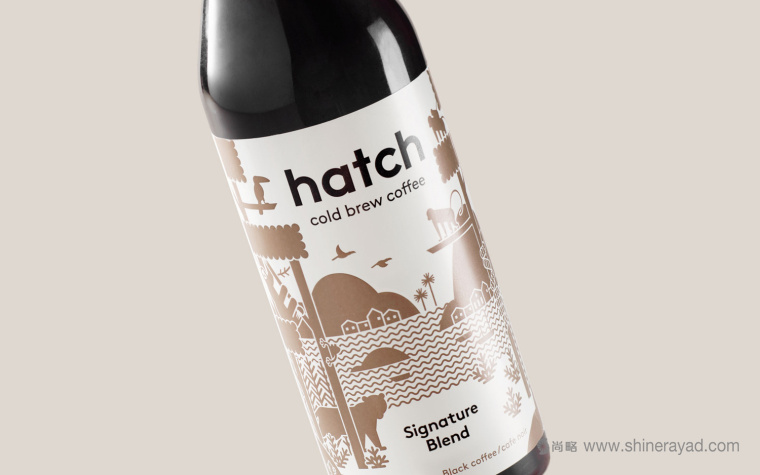
包裝插畫設(shè)計做得很好����,在插畫中體現(xiàn)了手工品質(zhì),在內(nèi)容中體現(xiàn)了產(chǎn)品的起源和對于內(nèi)容的探索。這些是一元線性和剪影的完美結(jié)合��,正空間和負空間恰當(dāng)?shù)仄胶?�,即使簡單的色彩也有非常良好的前景感��,中景感和背景感�。從遠處看可以感受到很好的視覺肌理。許多細小的細節(jié)靠近就能看到����,一些明顯的形狀可以用來做快速區(qū)分。恰當(dāng)?shù)恼{(diào)色板讓整體感覺獨特��,有趣����,時尚,不同的類別體現(xiàn)不同功能�。
Illustrations are well-done, make a connection with craft in its drawing, provenance and exploration in its content. These are a nice mix of monolinear lines and silhouettes, a good balance of positive and negative space and have a fairly good sense of foreground, middle ground and background, even as a single colour. There is a pleasant visual texture from a distance, lots of small little details up close, and some stronger forms that help for quicker differentiation. Alongside a modest colour palette these feel distinctive, interesting and contemporary, and function to separate varieties.

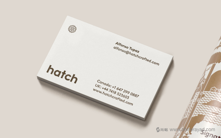
不同大小的Lineto’s Brown是當(dāng)下流行的。它的形狀有多種可供選擇���,包括monolinear和所有小寫字體排版����。涂層板上的棕色墨水和枕花制法賦予了一種質(zhì)樸的手工品質(zhì)感。無論是排版形式���,顏色或是材料表面都傳達出這是一種現(xiàn)代的�����,方便的���,高品質(zhì)咖啡產(chǎn)品。Logo設(shè)計的很有趣�����,但是形式上比較抽象�����。它和產(chǎn)品的類型以及插畫保持一致����,并在空間安排上彼此平衡�。雖然品牌名稱很緊湊,但在社交媒體的背景下也許更有效�。
Type; various weights of Lineto’s Brown, is thoroughly current and accessible in its shapes, monolinear lines and all lowercase typesetting. Brown ink and debossing across uncoated board gives this a more earthy and crafted quality. Both typographical form, colour and material finish appear well-suited to a modern, convenient and high quality coffee product, and shares some of the qualities of illustration. Logomark is interesting but abstract in its forms, consistent with type and illustration in its lines and balance of space, and although brand name is compact, works better in social media contexts.
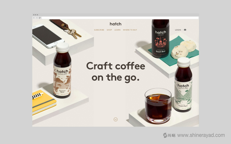
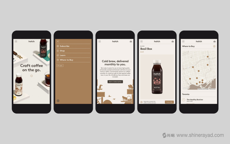
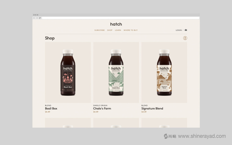
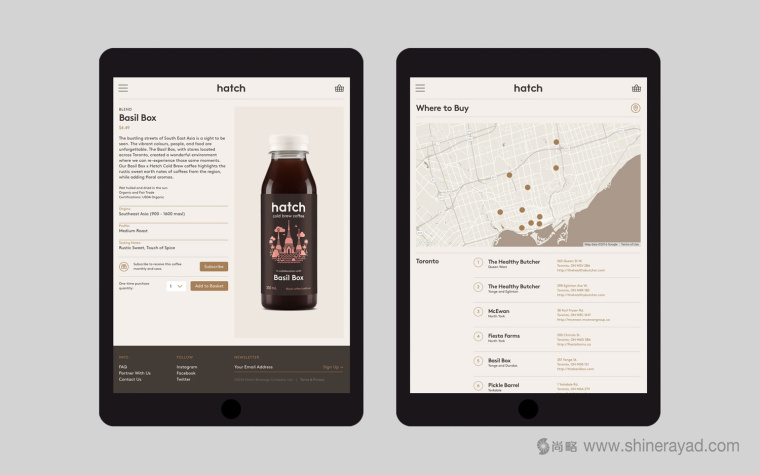
整體設(shè)計風(fēng)格在包裝設(shè)計,品牌VI視覺識別設(shè)計和網(wǎng)站設(shè)計上的連續(xù)性很強。店面提供了一定的功能性�,這里可以購物,加入會員��,或者對店面做更進一步了解 - 這可以通過視頻來增強��?�?Х确浅>?����,一包連著一包�,很方便每天攜帶。為那些追求味道細微差別��,手工藝和原汁原味的人提供更深入的了解機會�����。
The continuity between packaging, visual identity and website is strong. The site offers a layer of functionality, providing access to shop, subscriptions and further insight, which is augmented by moving image. It is very well polished, end to end, and manages to move between the everyday accessibility and the insight expected by those more interested in flavour nuance, craft and origin.
文章翻譯發(fā)布:尚略廣告���,上海logo設(shè)計公司��,上海包裝設(shè)計公司��,上海網(wǎng)站設(shè)計公司�,上海品牌策劃公司,轉(zhuǎn)載請注明出處���。
尚略上海品牌策劃設(shè)計公司快速導(dǎo)航: