BrandOpus品牌設(shè)計(jì)公司在繼上次給Kingsmill重新設(shè)計(jì)了品牌視覺的18個(gè)月后���,又一次幫他們做了同樣的事情����。以此幫助他們?cè)谑袌?chǎng)中跟上形勢(shì)�����,應(yīng)對(duì)“切片面包市場(chǎng)銷售量日益減少”的問題����。
ingsmill has
been given a new visual identity by Brand Opus 18 months after its last rebrand, to help it keep up in the market as “sliced bread sales decline”.
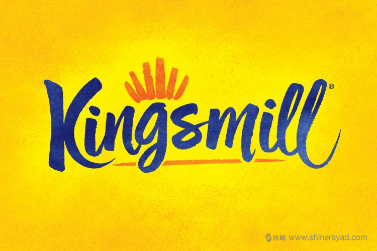
面包品牌Kingsmill在兩年時(shí)間第二次做品牌形象設(shè)計(jì)��。放棄了去年五月份的推出的海軍藍(lán)設(shè)計(jì)而改用黃色�����。
Bread
brand Kingsmill has been rebranded for the second time in two years, ditching its navy blue design unveiled in May last year for a yellow one.
BrandOpus是這次的設(shè)計(jì)師�����。新的品牌形象把Kingsmill和手工制作更密切地聯(lián)系在一起���。保留了之前的海軍藍(lán),橘色和黃色�����,但是用了更濃烈��,更有手工質(zhì)感的形象��。
Designed
by BrandOpus, the new branding looks to associate Kingsmill with a more hand-crafted approach. It retains the navy blue, orange and yellow colour palette of the previous branding, but takes on a rougher, more hand-painted look.
BrandOpus的創(chuàng)意總監(jiān)Paul Taylor說:“藍(lán)色和黃色是Kingsmill的最好詮釋色��。我們認(rèn)為為了品牌識(shí)別�,新logo設(shè)計(jì)保留原來的色調(diào)很重要。但是我們轉(zhuǎn)變了基本的平衡��,讓有溫暖之地的黃橘色背景來體現(xiàn)面包房的暖意��?��!?/p>
Paul
Taylor, executive creative director at BrandOpus, says: “Blue and yellow are colours synonymous with Kingsmill and we felt it important to retain this colour palette for brand recognition, but we have fundamentally shifted the balance to allow the ‘toasty’ textured yellow-orange background to evoke the warmth of bakery.”
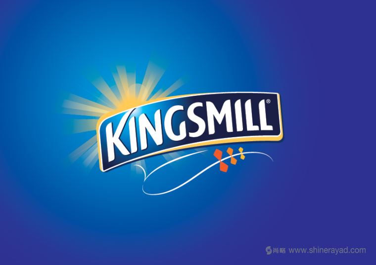
此次品牌形象重塑是在繼上次重塑后僅僅18個(gè)月的時(shí)間展開的�。那次也是由BrandOpus來完成的�����。他們見證了干凈的海軍藍(lán)和明亮的陽光以及干凈利落的白色標(biāo)識(shí)的品牌形象定位��。
The rebrand comes just 18 months after Kingsmill’s last
rebrand, also completed by BrandOpus, which saw a clean, navy blue identity introduced with a bright sun and crisp, white logotype.
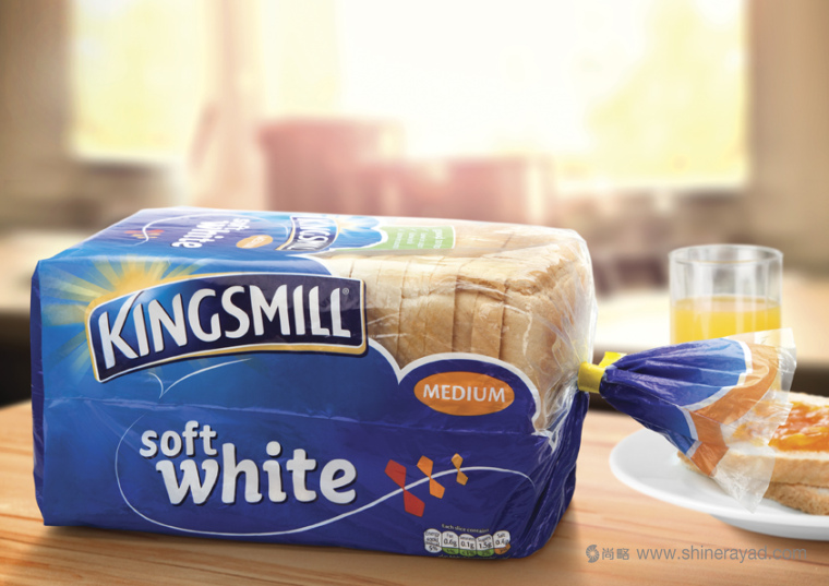
根據(jù)BrandOpus品牌設(shè)計(jì)公司上次的設(shè)計(jì)�����,用能展示積極內(nèi)涵的藍(lán)色天空體現(xiàn)品牌定位��。這次這個(gè)形象用更溫暖的�����,橘色手繪刷版本的標(biāo)志。
This
identity, which was created to produce positive connotations of blue skies according to BrandOpus, has now been replaced with a warmer, orange identity with a hand-drawn brush-script logotype.
新logo字體由大寫的無襯線字體變?yōu)樗⒐P小寫字體�����。渲染的日出形象用在Kingsmill里面“g”上面一個(gè)抽象的橘色刷筆代替����。
The
typeface has changed from an uppercase sans-serif to a brush-stroke lowercase, and the rendered sunrise symbol has been replaced with an abstract orange brush-stroke on top of the “g” in Kingsmill.
新的字體是和Alison Carmichael合作定制的字體。
The new typeface is a bespoke logotype that was developed with Alison Carmichael.
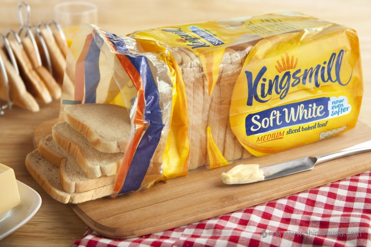
為了和新的品牌形象匹配�����,面包產(chǎn)品包裝設(shè)計(jì)也被重新設(shè)計(jì)了��。用黃色代替之前占主導(dǎo)色的海軍藍(lán)�����。
The
packaging has also been redesigned to match the new branding, replacing the predominately navy blue design with yellow.
Taylor說這種黃色現(xiàn)在扮演的角色是“在整個(gè)產(chǎn)品目錄中把品牌色統(tǒng)一起來”����。以此把Kingsmill從那種“為了產(chǎn)品而改變其包裝的品牌”中區(qū)分出來�。
Taylor
says this yellow will now act as a “consistent brand colour across the entire portfolio” to differentiate Kingsmill “in a category where brands change their pack colour by product”.
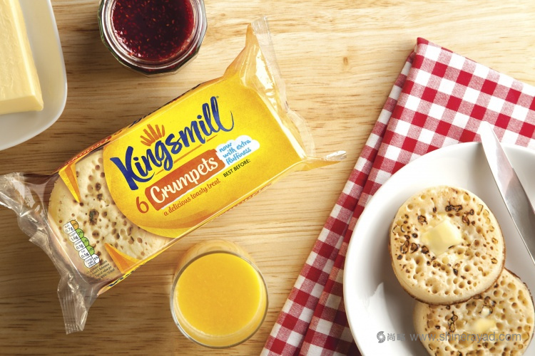
BrandOpus反映Kingsmill在品牌咨詢中為品牌注入了溫暖和簡(jiǎn)潔,因此在品牌推廣中采取的是“有質(zhì)感的�����,舒適溫暖的”黃色背景。
BrandOpus
says Kingsmill briefed the consultancy with bringing “warmth and simplicity” to the brand, and so introduced a “textural, toasty, warm” yellow background to the branding.
新的產(chǎn)品包裝設(shè)計(jì)外觀期待能夠把品牌形象從大規(guī)模量產(chǎn)者轉(zhuǎn)化到更具個(gè)性化��,自產(chǎn)的類型�����。集中在場(chǎng)景背后的人們和面包房的簡(jiǎn)單快樂����。BrandOpus如是說。
The
new look hopes to shift perceptions of the brand from “mass-manufacturer” to a more individual, home-grown one, focusing on “the people behind the scenes” and “the simple pleasures of bakery”, says BrandOpus.
Kingsmill在發(fā)布新包裝的時(shí)候并沒有提出在一年半后再次進(jìn)行品牌形象重塑的原因����。
Kingsmill
has not confirmed at the time of publishing why it decided to undergo a rebrand a year and a half after its last.
Kingsmill的母公司 - 英國(guó)聯(lián)合烘焙公司的發(fā)言人稱,Kingsmill在一年半后再次進(jìn)行品牌形象重塑使得其在市場(chǎng)上更加矚目���。
A
spokesperson at Allied Bakeries, the parent company of Kingsmill, says Kingsmill underwent a rebrand a year and a half after its last to give it “greater shelf standout”.
他們還提到����,“Kingsmill 在他們想要改進(jìn)消費(fèi)者和產(chǎn)品互動(dòng)的時(shí)候����,它在某種程度上是商家的身份���。這就是他們?yōu)槭裁锤倪M(jìn)品牌設(shè)計(jì)。重要的是重新設(shè)計(jì)品牌形象和包裝�����,使得大眾更加關(guān)注這個(gè)品牌�,成為了產(chǎn)品的指示牌?!?/p>
“Kingsmill
is at a point as a business when they want to redefine how customers interact with the category, which is why they’ve brought new designs to market,” they say. “An important part of this is developing branding and packaging which gives greater standout on shelf and acts as a signpost to the category.”
Taylor說道因?yàn)樵谶^去一年中市場(chǎng)地位的變化,品牌推廣的重大改變是必需的����。他還說道,競(jìng)爭(zhēng)壓力創(chuàng)造了加強(qiáng)品牌關(guān)聯(lián)性的需求�。因?yàn)榍衅姘匿N售量在下降。
Taylor
says “a dramatic change” to the branding was necessary because of “shifts in the market place over the past year”. “Competitive pressures…created a need to strengthen the brand relevance as sales in sliced bread were in decline,” he
says.
這個(gè)項(xiàng)目為時(shí)10個(gè)月完成�����。新的品牌形象和包裝設(shè)計(jì)將在這個(gè)秋天的銷售點(diǎn)產(chǎn)品和包裝期間推出���。
The
project took 10 months to complete. The new branding and packaging will roll out across point-of-sale products and packaging this autumn.
翻譯發(fā)布:尚略廣告上海品牌形象設(shè)計(jì)公司�����,上海包裝設(shè)計(jì)公司策劃設(shè)計(jì)部���,轉(zhuǎn)載請(qǐng)注冊(cè)出處。
本文網(wǎng)址:http://www.uk2b.cn/news_info.asp?id=2374
尚略上海品牌策劃設(shè)計(jì)公司快速導(dǎo)航: