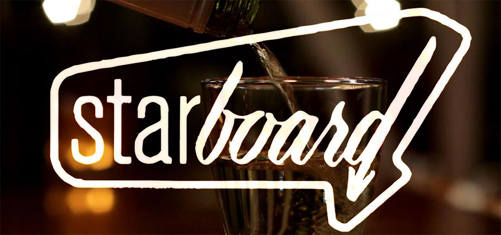
Starboard is a restaurant in San Francisco’s Mission District that’s trying to keep alive the neighborhood’s Mom and Pop, punk rock aesthetic. I live in the Mission, the founders of the restaurant live in the Mission, and we love this neighborhood. But while we’re glad it’s a whole lot safer here than it was ten years ago, the influx of tech money has forced out some of the more quirky businesses that used to be bastions of San
Francisco’s creative spirit.
Starboard 是一家位于三藩市Mission區(qū)的餐廳��,這個區(qū)正在努力維持社區(qū)的小商店和朋克搖滾美學(xué)��。我住在這個區(qū)�����,這家餐廳的創(chuàng)始人也住在這個區(qū)��,我們喜歡這里����。這里比十年前更加安全了����,這讓人很開心。技術(shù)資金的流入開始強(qiáng)迫這里一些獨特的商業(yè)形式離開這里,而這些商業(yè)形式正式三藩市創(chuàng)新精神的堡壘��。
The genesis of the logo reflects this
desire to make things more madcap and less polished. The team started cutting up my first round of sketches and pairing the pieces. At first I was pissed, but I softened when they told me why. They wanted the logo to set the tone for an identity that embraced a wide variety of stylistic influences. Matching a sans serif with a script sends a clear message that we’re doing things differently.
Logo設(shè)計的源點是反映出想要把事情打亂的這種愿望�����。團(tuán)隊把我第一輪的草圖剪亂����,然后再拼湊��。開始我非常生氣�����,但是他們告訴我原因之后就妥協(xié)了����。他們想要logo建立起擁抱不同類型的風(fēng)格的基調(diào)。搭配無襯線字體和清晰表達(dá)我們與眾不同的做事方法的手稿�����。
For the rest of my career, I’ll remember
sitting at the bar with the owners after it closed, pouring a glass of whiskey and spending an hour trying to make the next person laugh. In the midst of this, somehow, we started imagining what the dishes might look like if we
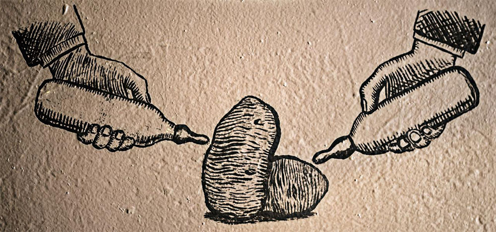
illustrated them literally. How do you draw a Hawaiian pork sandwich without actually depicting sliced pork on a bun? What would our mascot be? The ideas covered the spectrum from juvenile to surreal, and if they still held up the next morning, I created mockups for the team.
在我接下來的職業(yè)生涯中�,我會記得在餐館打烊后和老板坐在吧臺上,倒一杯威士忌,花費一個小時的時間讓旁邊的人笑起來��。在這期間不知怎么的�,我們開始想象如果我們真正地把菜品畫出來會是什么樣子。沒有描繪出在小圓面包上的豬肉片你應(yīng)該如何畫出夏威夷豬肉三明治呢���?我們的吉祥物是什么�����?整個餐飲品牌形象設(shè)計的風(fēng)格如何���?這些想法包括了從幼稚的到超現(xiàn)實主義的,誰都不知道第二天早晨是否還有這些想法�����,于是我為團(tuán)隊設(shè)計了品牌形象的初步輪廓�。
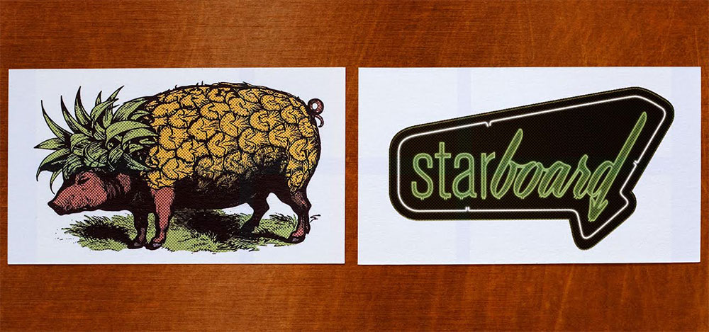
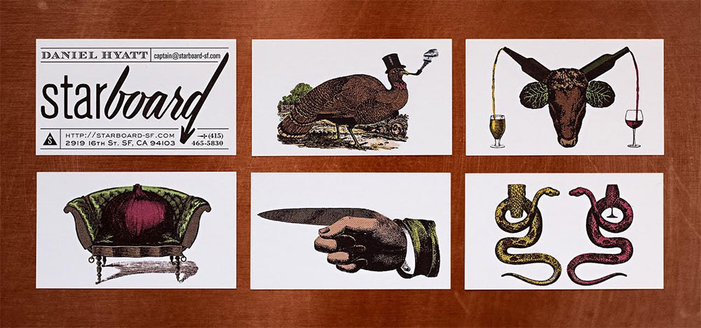
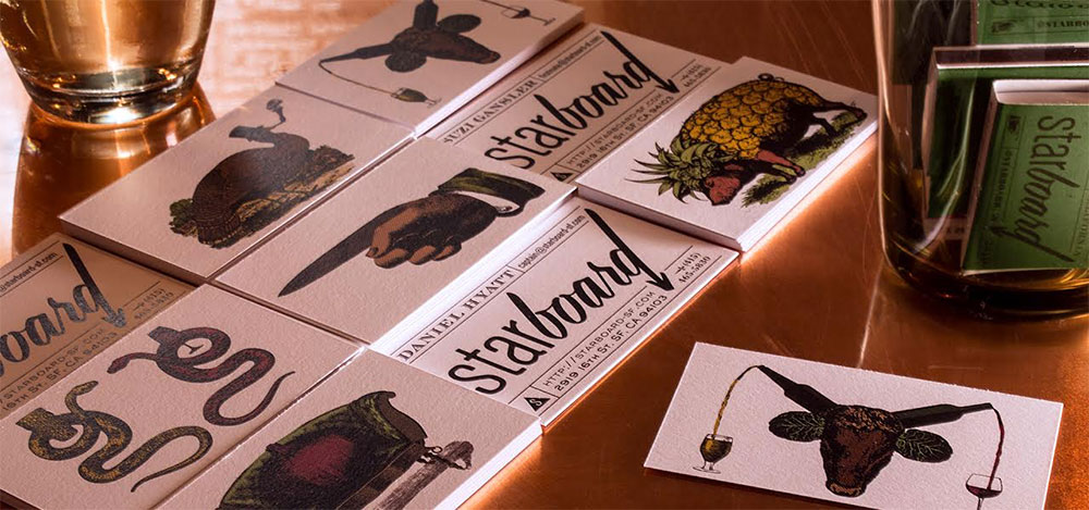
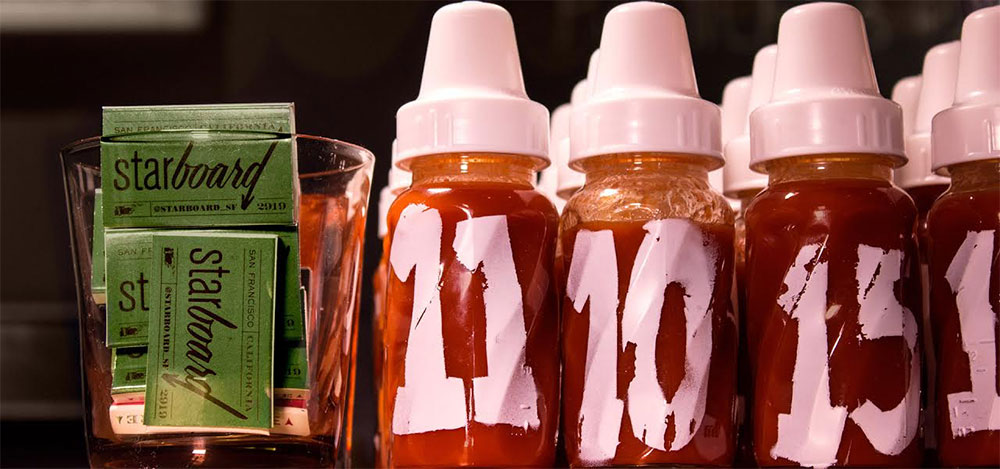
Before I started designing, I spent a few
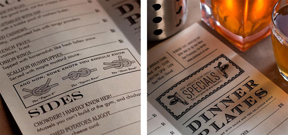
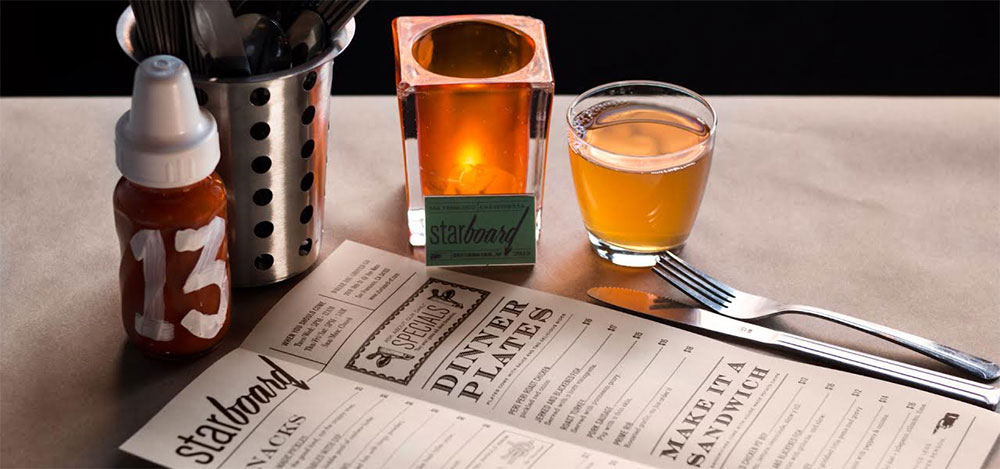
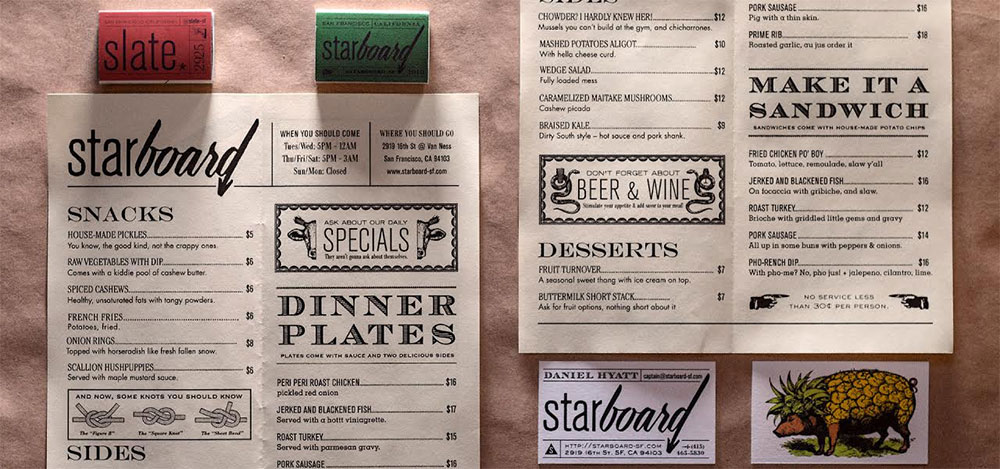
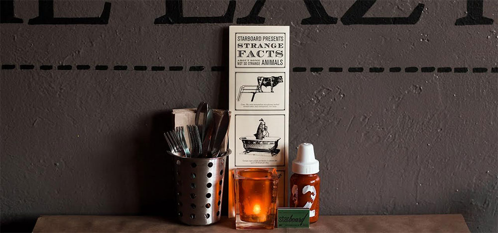
afternoons at the public library. The SFPL has an extensive restaurant ephemera collection that dates back to the early 1900s and the pieces were really inspiring. The fonts in the Starboard identity (there are 10 of them) were all common on local menus during different historic periods and you’ll see nods (“no service less than 30 cents a person”) to messaging from a bygone era. Like the logo, this typographic mash-up sets the tone for an eclectic dining experience, and the language on the menu (“with horseradish like fresh fallen snow”) lets you know that we take our food seriously, but not ourselves.
在開始設(shè)計之前,我在公共圖書館呆了幾個下午��。圖書館中有大量關(guān)于餐館的藏書��,有的甚至是上世紀(jì)初的書���,這些都非常富有靈感�。 Starboard 品牌形象(總共有十個)的字體是不同歷史時期中的普通餐館的菜單字體�,你會看到類似于“nods”(低于30美分一人不提供服務(wù))這樣過去時代的文字。就像logo一樣�,字體的混搭創(chuàng)造了電子用餐體驗,菜單上的語言(用像是剛剛降落的雪花一樣的辣根)讓你知道我們認(rèn)真對待我們的食物���,而不是自己����。
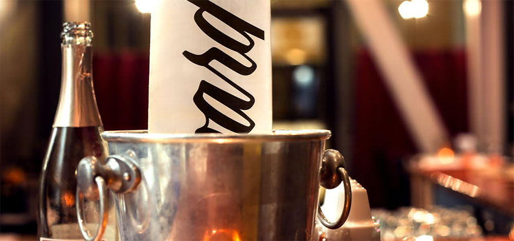
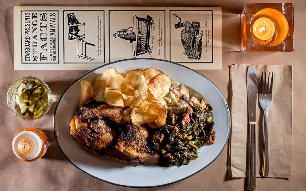
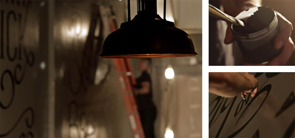
I knew I had to paint a mural as soon as I
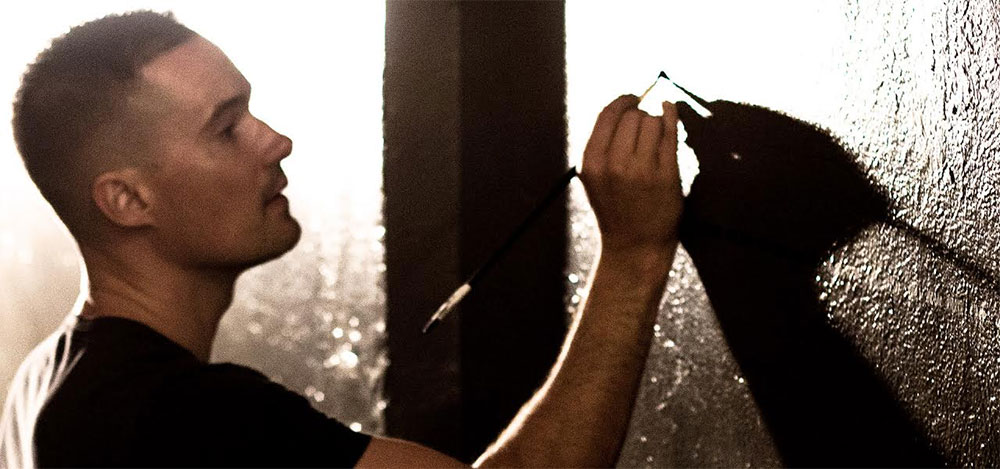
saw the giant walls of the space, but deciding what to put on those walls took a little doing. My ideas came across a little too “preachy” for the Starboard team. They’d seen enough manifestos in restaurants and the last thing they wanted was to sermonize.
在我第一眼看到大面積的墻面的時候我知道我一定要畫一幅壁畫����,只是在上面畫什么東西需要好好想想。我的想法對于starboard團(tuán)隊來說有點嘮叨���。他們看夠了餐館里的聲明����,說教是他們最討厭的了。
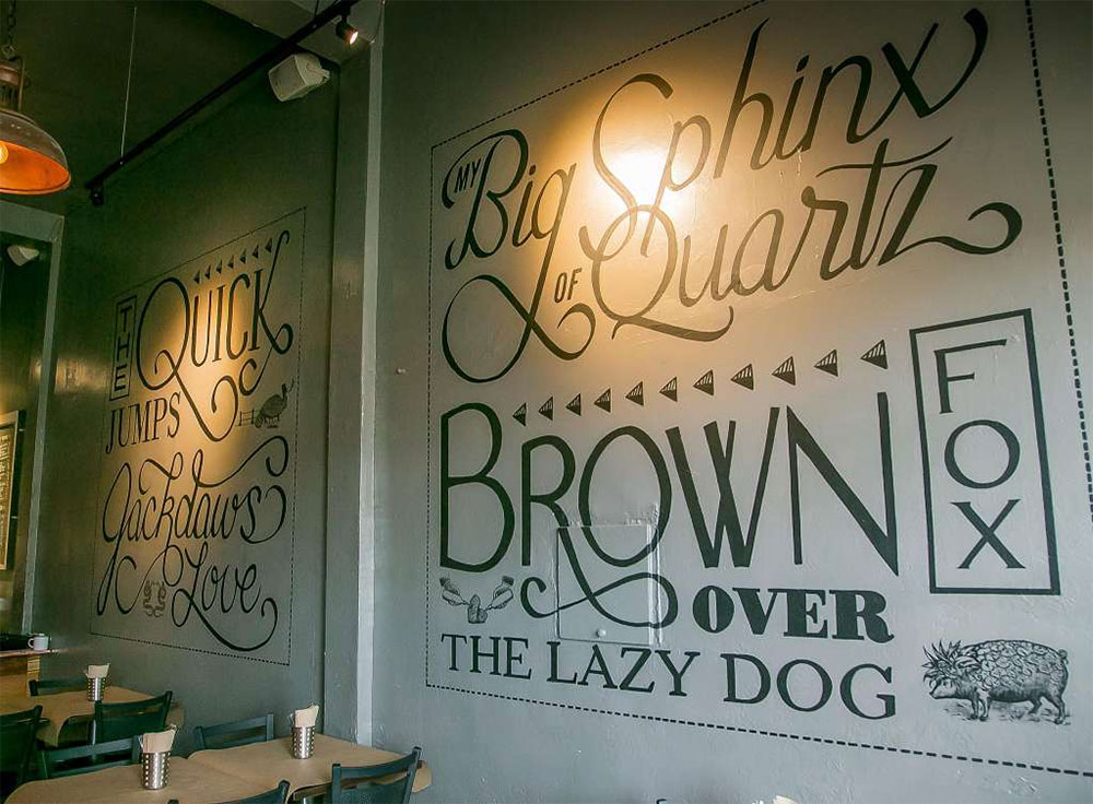
We went back and forth, and as I often do, I started drawing letters as we talked, just picking any word out of the conversation and trying to render it in an appropriate style. When they saw my sketches, someone said, “Yeah, let’s just do random words in all different styles.” Then someone else said, “We could do lorem ipsum!” “Chipotle did that on their bags,” I said, “And I’d rather not repeat it.” And just like that, “What about the quick brown fox…” came out of someone’s mouth. We all knew that was it.
我們思來想去����。就像我平常那樣,我開始在談?wù)摰臅r候畫出一些字母�����,隨便從對話中拿出一句什么話出來��,把它變成合適的風(fēng)格�。當(dāng)他們看到我的草圖的時候��,有的人說“對���,讓我們就用不同的風(fēng)格來畫一些詞語出來”��。有的人說“我們可以做亂數(shù)假文”�。我說“Chipotle在他們的背包上這么做了��,我可不想重復(fù)?���!本湍菢佑械娜苏f“快速的棕色盒子呢”,我們知道就是它了����。
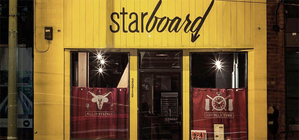
It was important to me to make sure people got a feel for the vibe just walking by the place. We wanted to get your attention from across the street. The yellow helps, as does the hand-painted sign with the arrow pointing down at the front door. But we also wanted to include some of the illustration and copywriting we’d been having so much fun with, so we created two window decals with as close to a motto as you’ll get out of this group — all of the fixings,
almost all the time.
對于我來說確保人們從這里經(jīng)過時他們能感受到一些氛圍是非常重要的�����。我們想要從你經(jīng)過這里時就吸引到你��。黃色很有效��,手繪的箭頭指向前門也很有效。但是我們也想包含帶給了我們很多樂趣的東西帶有版權(quán)的插畫�,所以我們設(shè)計了兩個窗戶貼紙,當(dāng)你從這里離開的時候就像一個格言一樣提醒你 - 隨時提供美食��。
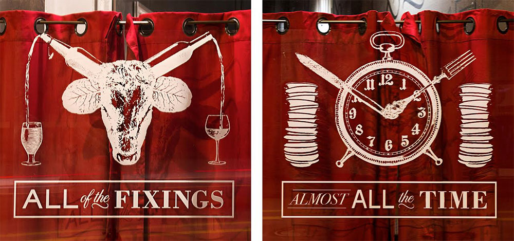
Time and again on this project, when I started taking things in a classic “design” direction, the team at Starboard reminded me to zig instead of zagging so we could give diners an experience they can’t have anywhere else. They wanted the design to be as personal as the food and the service, and I’m grateful to them for encouraging me to step outside my comfort zone.
又一次���,當(dāng)我開始用傳統(tǒng)的設(shè)計方向處理這個項目的時候��, Starboard團(tuán)隊提醒我們要顛覆而不是更委婉一些��,這樣才會給用餐者帶來無可替代的用餐體驗�����。他們想要設(shè)計和食物和服務(wù)一樣更具個性化����,我很感激他們鼓勵我走出我的舒適區(qū)�。
If you happen to be in San Francisco, please stop by and tell them I sent you. I recommend the Pho-Rench dip with steak au poivre on an Acme roll with a Vietnamese jus, but everything’s just as delicious as it is quirky — that’s why I love the place.
如果你碰巧也在三藩市�,請一定到此停留并告訴他們是我讓你來的。我推薦黑胡椒牛排Acme卷和越南果汁���。每道食物都既美味又獨特���,這就是我喜歡這個地方的原因�����。
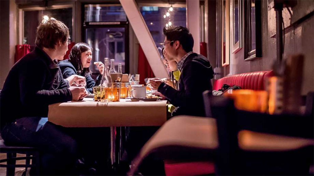
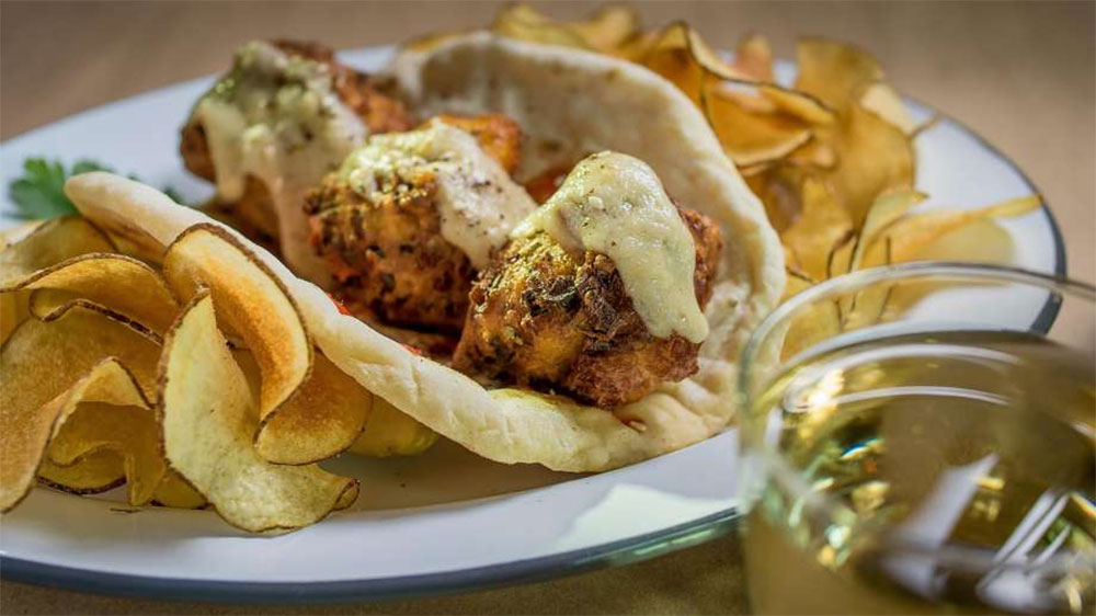
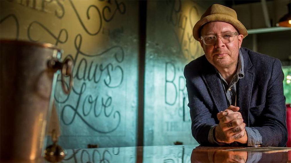
尚略廣告���,上海品牌設(shè)計公司設(shè)計部點評�����,Starboard餐廳餐飲logo設(shè)計像一只彭跑的牛���,圖形非常簡化的牛�����,品牌形象設(shè)計的核心�����,是一套手繪風(fēng)格的非常具有創(chuàng)意和復(fù)古風(fēng)格的藝術(shù)插畫���。這種風(fēng)格為餐廳創(chuàng)造了放松,愜意��,愉快的氛圍�,讓客人愿意來,愿意在這多待會兒����。
本文網(wǎng)址:http://www.uk2b.cn/news_info.asp?id=2511,源自:http://identitydesigned.com/starboard/����,轉(zhuǎn)載請注明出處�。