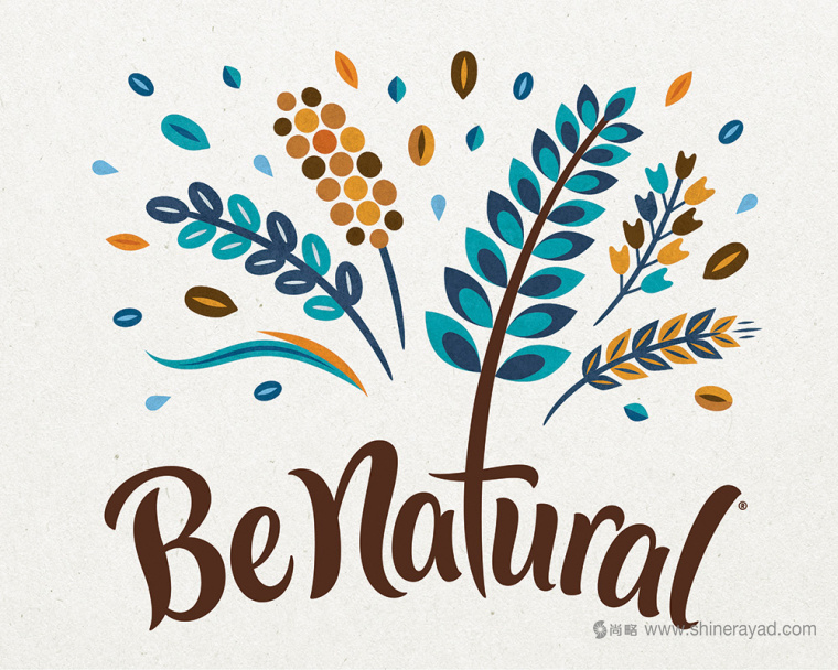
Be Natural在1987年首次進(jìn)行銷售并開發(fā)出了甜味和咸味小吃的產(chǎn)品線����,2000年被Kellogg’s Australia收購�,現(xiàn)在產(chǎn)品的重心是早餐燕麥片和甜食棒���。從小麥粉到格蘭諾拉燕麥卷�����,燕麥片/棒都是用“以植物為基礎(chǔ)的提高營養(yǎng)價(jià)值的食品”做成的�。
First sold in 1987 and evolving as a line
of sweet and savory snacks, Be Natural, owned by Kellogg’s Australia since
2000, is now focused on morning cereals and sweet snack bars. From grain flakes
to granola, the cereals (and the bars) are made from “nutritious uplifting
plant-based foods.” Last year, Be Natural introduced a new logo and packaging
designed by Sydney-based
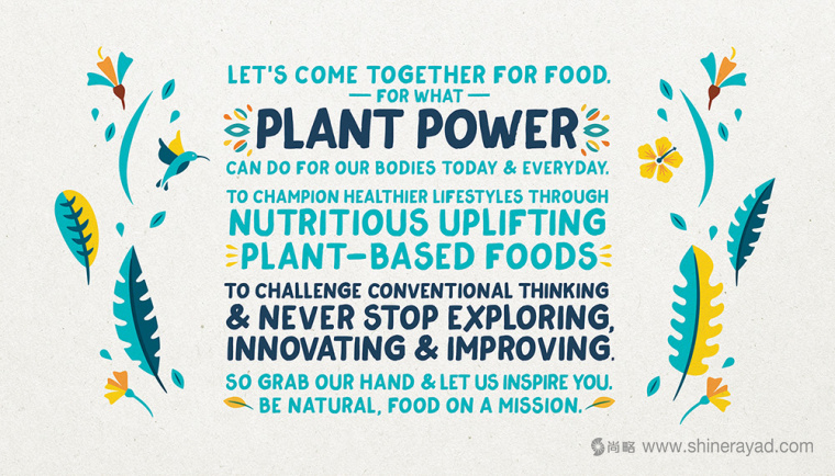
Loop Brands 品牌設(shè)計(jì)公司的設(shè)計(jì)任務(wù)是為主流的燕麥片和小吃做品牌重塑并重新對品類進(jìn)行分類����。品牌以注重飲食健康和關(guān)注最新食物潮流的人群為目標(biāo)�。從植物力量中提升健康成為了所有傳達(dá)渠道的關(guān)鍵因素��,以此來激發(fā)出每個(gè)人的吃貨基因�。
Loop Brands. Loop Brands were tasked to reinvent
mainstream cereal and snacks and disrupt the category. Targeting consumers who
are proactive about eating healthier and are mindful of the latest food
trends. ‘Uplifting health from plant
power’ became the linchpin of all communication to inspire the foodie in all of
us.
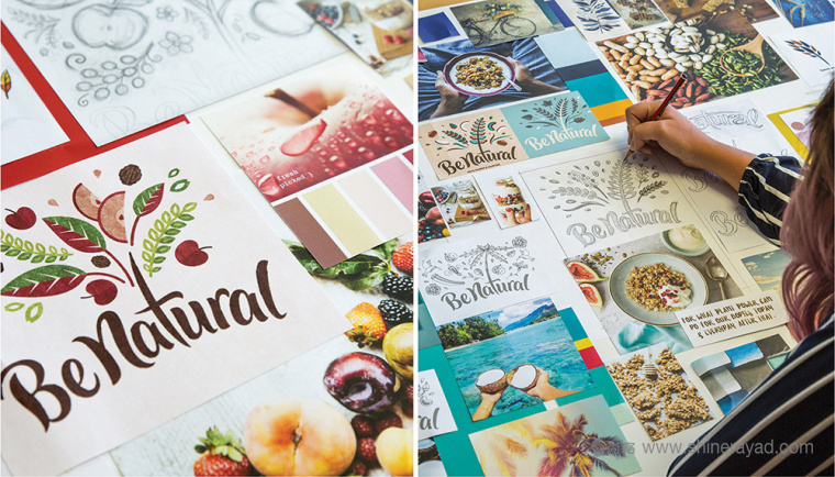
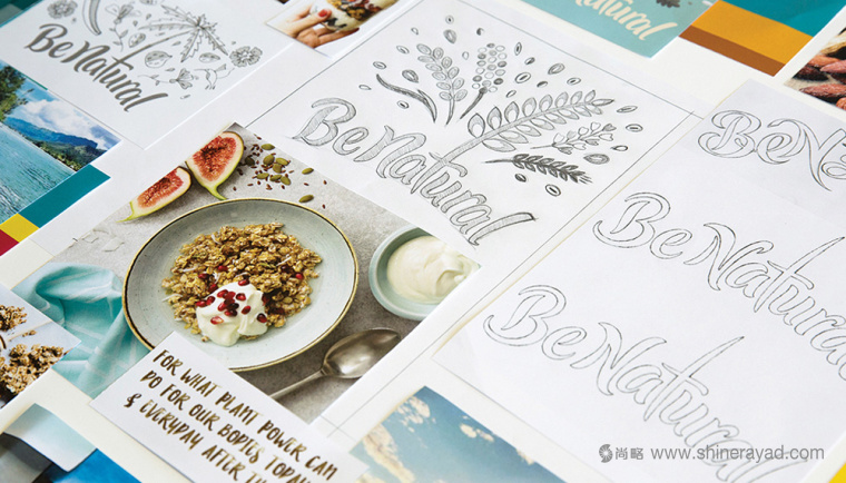

以前的logo看起來和其它格蘭諾拉燕麥卷,燕麥片和其他類似產(chǎn)品沒有什么區(qū)別����。給我留下的印象是Nature Valley - 友好的類型和粗紋理的質(zhì)感。以前的logo也有從品牌名中的“e” 和 “a”中發(fā)芽的葉子����。這并不可怕,但也沒有令人印象深刻�����。
The old logo looked like a number of
nature-y granolas, cereals, and other similar products — or maybe I’m just
thinking of Nature Valley — with the friendly type and rough-edged textures.
The old logo also had the bonus of sprouting leaves rather poorly from the “e”
and “a”. It wasn’t terrible but nothing memorable either.
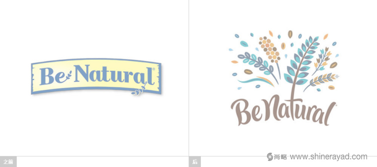
新logo設(shè)計(jì)���,從一個(gè)曲線上的一個(gè)腳本文字標(biāo)志的橫幅上突出���,這不是特別出眾,但是足夠有吸引力 - 從“t”發(fā)出一串植物,這感覺有點(diǎn)強(qiáng)迫����,但是它充分表達(dá)了它的用意。雖然排版不是我最喜歡的部分�����,但是我喜歡很酷的中世紀(jì)現(xiàn)代輕美學(xué)風(fēng)格的爆炸表現(xiàn)手法��,它與每個(gè)燕麥片的成分相匹配���。
The new logo breaks out, wildly, from the
banner with a script wordmark on a curve — that is not particularly great, but
attractive enough — that sprouts a flurry of “plant power” from the “t”, which
feels a little forced but it gets the point across. While the typography is not
my favorite part, I do love the explosion above as it has a cool Mid-Century
Modern lite aesthetic and it changes to match the ingredients of each cereal
and bar.
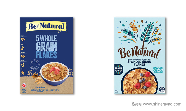
舊包裝平淡無奇,營造出的自然感覺非常做作�,因?yàn)樗纫还蕖拔也桓蚁嘈胚@并不是黃油”更誘人。
The old packaging was far from inspiring and its natural-ness felt like it had to be force-fed through the textured typography because it didn’t look any more enticing than a tub of I Can’t Believe it’s Not Butter����。

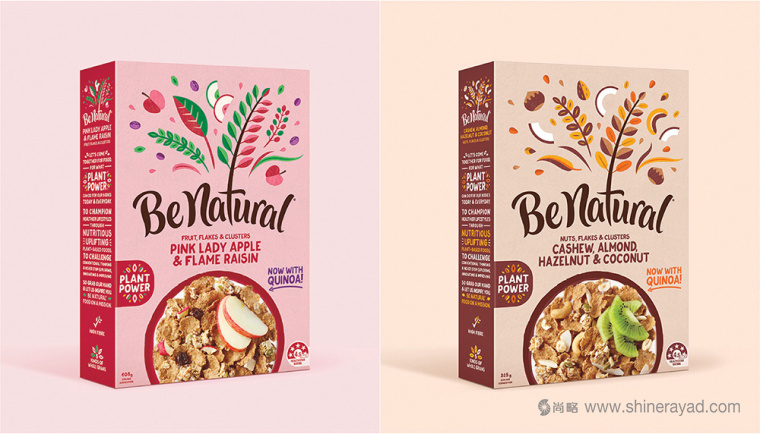
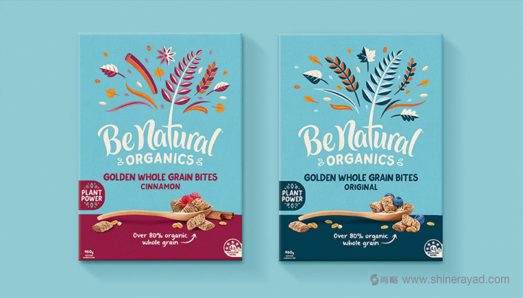

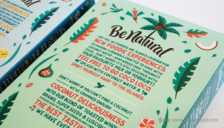
新包裝設(shè)計(jì),尤其是高筒的燕麥包裝盒���,通過讓產(chǎn)品名和植物插畫占據(jù)了近乎包裝幅面的一半的方式巧妙地利用了新logo�,創(chuàng)造出了出眾的視覺和貨架展示效果�。但是產(chǎn)品的照片可以做的更好,也許至少不是把它放在一個(gè)椰子殼里面。大部分情況下它和大logo非常協(xié)調(diào)�����。整體的排版很得體���,改變了手繪的粗糙效果(這本應(yīng)該用更有設(shè)計(jì)感的字體代替的���,看看下面的“COCONUT DELICIOUSNESS”)
The new packaging design, especially the tall cereal
boxes, make great use of the new logo by having the name wide and the plant
power illustration take up nearly half of the packaging, creating a highly
visible and distinct shelf presence that looks really great. The product
photography could be better somehow — maybe at least not putting it in a
coconut bowl — but for the most part it balances out well with the large logo.
The typography throughout is decent, changing the rough textures of yore for a
wobbly, hand-written effect (that could have been pushed further with a font
with stylistic alternates; see “COCONUT DELICIOUSNESS below).

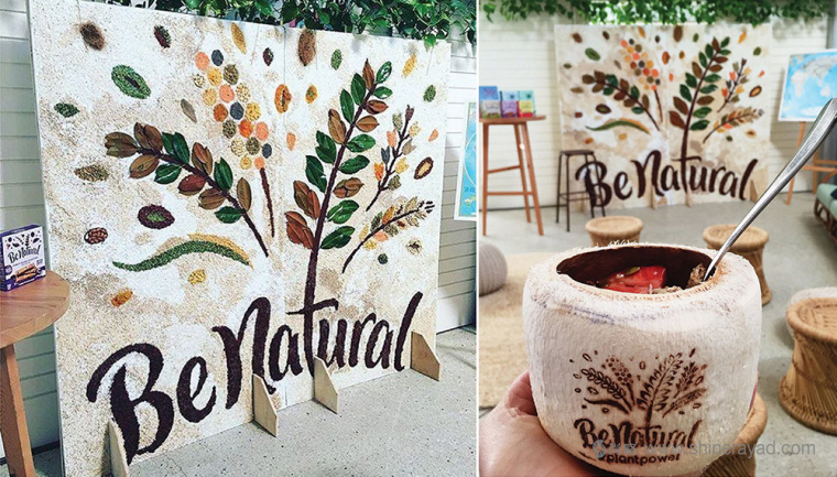
總之,這在保持小的包裝批次(我敢說也是手工的)的自然產(chǎn)品���,并與市場推廣和Kellogg分銷能力相協(xié)調(diào)的同時(shí)�,讓產(chǎn)品在以前外觀基礎(chǔ)上是有了感性的提升��。
Overall, this is a sweet update that makes
a huge improvement on the previous look while putting this in line with the
aesthetics of smaller-batch (and dare I say artisanal) natural products yet
with the marketing and distribution power of Kellogg’s
食品包裝設(shè)計(jì)案例分享�,上海logo設(shè)計(jì)公司,上海包裝設(shè)計(jì)公司����,上海品牌設(shè)計(jì)公司,尚略廣告���。
本文網(wǎng)址:http://www.uk2b.cn/news_info.asp?id=2541���,源自:http://www.underconsideration.com/brandnew/archives/new_logo_and_packaging_for_be_natural_by_loop_brands.php#.WKQUJflJJ0G����,轉(zhuǎn)載請注明出處�����,